The Wiert Corner – irregular stream of stuff

Jeroen W. Pluimers on .NET, C#, Delphi, databases, and personal interests

  • My badges

  • Twitter Updates

  • My Flickr Stream

  • Pages

  • All categories

  • Enter your email address to subscribe to this blog and receive notifications of new posts by email.

    Join 1,861 other subscribers

Archive for the ‘Font’ Category

JetBrains Mono: A free and open source typeface for developers | JetBrains: Developer Tools for Professionals and Teams

Posted by jpluimers on 2021/09/30

Font I want to try out: [Archive.is] JetBrains Mono: A free and open source typeface for developers | JetBrains: Developer Tools for Professionals and Teams.

It has a large X-height and is sans serif, just like the lovely [WayBack] Lucida Console font, which I have been using for almost 3 decades.

So I wonder if JetBrains Mono can convince me to switch away from Lucida Console: no other monospaced font has convinced me yet (:

Via: [Archive.is] Matt Ellis on Twitter: “JetBrains Mono. A really nice, open source, ligature friendly, developer typeface. I’ve been using this for a while now, it’s my default font. And a really cool landing page! “

Edit 202109301T1300

JetBrains is discussing on how to update the Chocolaty support, see the twitter posts below:

Referred repositories in that thread:

–jeroen

Read the rest of this entry »

Posted in Development, Font, JetBrains Mono, Lucida Console, Power User, Programmers Font, Software Development | Leave a Comment »

KIX-code: informatie en downloaden | PostNL

Posted by jpluimers on 2021/08/20

PostNL maakt bij de sortering van post gebruik van een streepjescode: de KIX (KlantIndeX). Deze code voegt u toe aan de adresgegevens. De KIX bevat de gegevens die wij nodig hebben om uw post met de modernste sorteermachines te verwerken. Door de KIX bij het adres af te drukken helpt u ons om de kwaliteit van de dienstverlening te verbeteren.

Note that in order to install the KIX font on macOS/OS X/Mac OS, you

Read the rest of this entry »

Posted in Barcode, Development, Font, KIX, KIX Font PostNL, LifeHacker, Power User, Software Development | Leave a Comment »

Do you like/use the Slate font by OnePlus? Do you prefer it over Roboto? – Quora

Posted by jpluimers on 2020/11/02

No, I do not like the OnePlus Slate font, despite the lower x-height.

Background:

The fonts (images from Wikipedia):

Roboto – Wikipedia

Slate (typeface) – Wikipedia

–jeroen

Read the rest of this entry »

Posted in Android Devices, Font, LifeHacker, OnePlus Five, OnePlus Six, Power User | Leave a Comment »

Typografische Strafzettel – Nerdcore

Posted by jpluimers on 2020/10/19

Want: [WayBack] Typografische Strafzettel – Nerdcore

Hoefler&Co verkauft Typografische Strafzettel für Schlechtsetzer und Buchstabenkombinationsnullen. Die Schriftverbrechen gliedern sich auf dem Strafzettel in Vergehen der Auswahl (wie der unironische Einsatz „amüsanter“ Schriften oder die amateurishe Anwendung von Schriftauszeichnung ), der Komposition (zuviele Schriftgrößen, schlechtes Kerning), der Zeichensetzung (Ligaturen, korrekte Anführungen) und in Schwere Ästhetikverletzungen (elektronische Schrägschrift, Verzerrung). Großartige Idee, und sie haben nichtmal ComicSans mit Namen erwähnt. Toll! (via Jason Kottke, Bild des ganzen Strafzettels unten via /u/hova414) By special issue from the 100% totally real Typographic Violations Division, the Uniform Ticket Book is standard equipment for the modern design enforcer. Lists thirty-two common design infractions, each

I wish they were available outside in Europe, as it looks like it is is USA only with large foreign shipping costs at [WayBack] The Typographic Ticket Book – Hoefler&Co:

By special issue from the 100% totally real Typographic Violations Division, the Uniform Ticket Book is standard equipment for the modern design enforcer. Lists thirty-two common design infractions, each with an appropriate penalty, with plenty of room for improvisation. Authoritatively typeset in Helvetica to provoke

Via:

Picture via [WayBack] reddit: Just got this in a swag bag : graphic_design

–jeroen

Read the rest of this entry »

Posted in Font, Fun, Geeky, Power User | Leave a Comment »

Interesting font comparison site (Courier New versus Lucida Console versus Consolas)

Posted by jpluimers on 2020/08/31

Font comparisons:

Via: [WayBackI forgot in which version of Windows, the command prompt defaulted to the Consolas font… – Jeroen Wiert Pluimers – Google+

Based on this, I found more font identification sites:

I tried both at  and  (used bySource: “techorama” – Google Search), but only WhatTheFont managed to get the glyphs and font similar fonts on both, and Matcherator got the glyphs wrong in both images, even after manually cropping.

Read the rest of this entry »

Posted in Font, Lucida Console, Power User, Programmers Font | Leave a Comment »

Need to look at monospaced programmers fonts again

Posted by jpluimers on 2020/05/27

At the time of looking, FiraCode would not work in Delphi but would in Visual Studio. Reminder for me to look at it again: [WayBack] GitHub – tonsky/FiraCode: Monospaced font with programming ligatures.

A cool feature of the font is that it has ligatures for common multi-character combinations like := or ...

Back when scheduling this, I was still at Lucida Console because of its large x-height and small line spacing.

It is time to revisit my font choice, so lets include at least these candidates:

–jeroen

related:

Edit 20200527: observations by Uwe Schuster

Posted in .NET, Delphi, Development, Font, Power User, Programmers Font, Software Development, Visual Studio 2015, Visual Studio and tools, vscode Visual Studio Code | Leave a Comment »

It’s actually only “Helvetica” if it comes from the Helvetia region of Europe. Otherwise you have to call it “sparkling Arial”

Posted by jpluimers on 2018/12/24

Check out [WayBackPavel A. Samsonov on Twitter: “It’s actually only “Helvetica” if it comes from the Helvetia region of Europe. Otherwise you have to call it “sparkling Arial””

Too much font goodness:

–jeroen

Read the rest of this entry »

Posted in Font, Fun, Power User | Leave a Comment »

Unicode spaces

Posted by jpluimers on 2018/09/25

For my link archive:

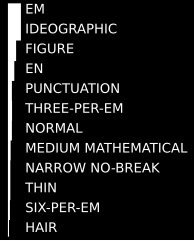
Via: [WyBack] Are there blank characters in unicode that have the same widths as period, comma and digits? – Lars Fosdal – Google+

Answer: no, though better fonts have period, comma, colon, semicolon and other punctuations the same width as the punctuation space.

The use-case:

I wanted right justified text without having to do custom positioning/drawing – where the decimal zero is white space.

F.x. here 12 instead of 12.0

9.5
11.6
12 <– #$2008 and #$2007
13.4

I.e. PunctuationSpace and FigureSpace

I don’t want to deal with positioning/rendering since it happens inside a third party component.

–jeroen

Posted in Development, Encoding, Font, Power User, Software Development, Unicode | Leave a Comment »

The origin of the space between in the “Heineken Brouwerij” logo of the Amsterdam brewery

Posted by jpluimers on 2018/04/02

On the very early adoption of the spacing in the typography:

Ooit wel eens stilgestaan bij het iets te grote gat tussen de woorden Heineken en Brouwerij op de Stadhouderskade? Of waarom de belettering op bruggen in de stad zo ‘Amsterdams’ aandoet? Waarschijnlijk niet. Typograaf Bas Jacobs deed dat wel. Zijn ontdekkingen bundelde hij in een speciale toeristengids.

A small book (just EUR 15) tells you more about his Amsterdam findings: Safari Typo Amsterdam

Source: [WayBackWaar komt Heineken spatie Brouwerij eigenlijk vandaan? – AT5: de nieuwszender van Amsterdam en omgeving

–jeroen

Posted in Font, History, Typography | Leave a Comment »

Alan Cox on G+: fonts that fit an 8×8 bitmap format but are variable width…

Posted by jpluimers on 2018/03/09

[WayBack] So here’s a questionDoes anyone know of any free fonts that fit an 8×8 bitmap format but are variable width. It’s pretty much going to have to be bitmap… – Alan Cox – Google+

[WayBackDamien Guard posted one: [WayBackhttps://damieng.com/special/MrCox.bdf

Hopefully there will be others.

–jeroen

Posted in Font, Power User | Leave a Comment »