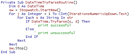
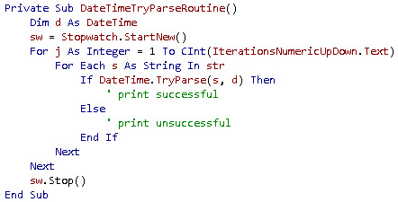
Interesting font comparison site (Courier New versus Lucida Console versus Consolas)
Posted by jpluimers on 2020/08/31
Font comparisons:
- [Archive.is] Differences – Lucida Console & Consolas
- [Archive.is] Differences – Courier New & Lucida Console
- [Archive.is] Differences – Courier New & Consolas
Via: [WayBack] I forgot in which version of Windows, the command prompt defaulted to the Consolas font… – Jeroen Wiert Pluimers – Google+
Based on this, I found more font identification sites:
- [WayBack] WhatTheFont! « MyFonts (where you have to upload an image)
- [WayBack] Fontspring Matcherator :: Find Fonts From An Image (where you have to upload an image or enter an URL; images are limited to 2 megabytes each; URLs have to end in
.jpgor.pngas for instance.jpg:largeand.jpg?s=largefail)- The same engine is used at [WayBack] Identify Fonts – The Font Squirrel Matcherator
I tried both at  and
and  (used bySource: “techorama” – Google Search), but only WhatTheFont managed to get the glyphs and font similar fonts on both, and Matcherator got the glyphs wrong in both images, even after manually cropping.
[WayBack] Jeroen Pluimers on Twitter: “Het @techorama font is zoo geweldig! Warme herinneringen aan mijn scalable font tijd bij Polyvroom en Mecanorma.… “
Related:
- [WayBack] Stupid Geek Tricks: Enable More Fonts for the Windows Command Prompt (via
HKEY_LOCAL_MACHINE\SOFTWARE\Microsoft\Windows NT\CurrentVersion\Console\TrueTypeFont)- Similar to
- [WayBack] Using Consolas as the Windows Console Font – Scott Hanselman
- [WayBack] Necessary criteria for fonts to be available in a command window (the WayBack works, original KB 247815 article is gone) which has these criteria
- The fonts must meet the following criteria to be available in a command session window:
- The font must be a fixed-pitch font.
- The font cannot be an italic font.
- The font cannot have a negative A or C space.
- If it is a TrueType font, it must be FF_MODERN.
- If it is not a TrueType font, it must be OEM_CHARSET.
Additional criteria for Asian installations:
- If it is not a TrueType font, the face name must be “Terminal.”
- If it is an Asian TrueType font, it must also be an Asian character set.
- The fonts must meet the following criteria to be available in a command session window:
- PowerShell varieties:
- Extra font requirements:
- [WayBack] Console Windows’ fonts · Issue #1410 · fontforge/fontforge · GitHub
- If it is an Asian TrueType font, it won’t be loaded on non-Asian installs of Windows.
- [WayBack] Console Windows’ fonts · Issue #1410 · fontforge/fontforge · GitHub
- Similar to
- [WayBack] Consolas and ClearType


–jeroen
[Archive.is] https://cdn.evbuc.com/images/26827141/86101336719/1/original.jpg (2160×1080) 


Leave a comment