


 Via [Wayback/Archive] Der Kneisner M100 – oder das “once in a lifetime project” | Computermuseum Visselhövede, about an IMSAI 8080 clone, I bumped into the VT220 based Glass TTY VT220 font and found some links of it and it’s modifications which are listed below by category
Archive for the ‘Font’ Category
A retro font: Glass TTY VT220
Posted by jpluimers on 2026/05/04

Posted in 8080, Development, Font, History, JavaScript/ECMAScript, LifeHacker, Power User, Retrocomputing, Scripting, Software Development | Tagged: DEC, fonts, Typography, vintagecomputing | Leave a Comment »
A 2D barcode on PostNL delivered packages can contain too much recipient information (via Security.NL and Tweakers.net): is this in the documented Data Matrix and who should fix this?
Posted by jpluimers on 2026/02/17
Yesterday, an important question appeared at almost the same time on Tweakers.net and Security.nl. It is about 2D barcodes on some packages delivered by PostNL. Some of these – I call them Data Matrix, as that is what they are – seem to include the e-mail address of the recipient.
The posts caused some uproar, and in order for myself to understand what is going on and what questions should be asked to PostNL, I wrote this blog post.
In any case: always remove parcel labels before disposing of the parcels, then destroy the labels. This has always been good privacy practice and will stay that way forever.
Regrettably, Tweakers.net blocks both the Wayback Machine and Archive Today, which makes their information ephemeral. Therefore I archived some of the Tweakers.net information in the gist [Wayback/Archive] “E-mailadres van ontvanger kan in PostNL barcode staan” archived from https://gathering.tweakers.net/forum/list_messages/2327530/0 · GitHub
Share this:
Posted in base64, Development, Encoding, Font, KIX Font PostNL, Power User, Python, Scripting, Software Development | Leave a Comment »
Fontendo (@Fontendou) / Twitter: Identifying & documenting fonts, obscure and otherwise from video games and other media.
Posted by jpluimers on 2026/01/09
Interesting as I know very little about fonts in Japan and the evolution:
[Wayback/Archive] Fontendo (@Fontendou) / Twitter
Identifying & documenting fonts, obscure and otherwise from video games and other media.
It is by [Wayback/Archive] Kaihatsu (@KaihatsuYT) / Twitter
Creativity through culture, & cultural literacy through games. Type designer in Japan.
Via: [Wayback/Archive] What’s the deal with this font? – YouTube
–jeroen
Share this:

Posted in Font, Power User | Leave a Comment »
MacOS (at least 2023 and younger): solution for (TrueType) fonts added through MacOS built-in Font Book not showing up in Pages or Preview
Posted by jpluimers on 2026/01/05
It took me a few queries to find the correct online solution for this problem: after adding a TrueType (and it’s extension: OpenType) font using the built-in MacOS Font Book, they do not show up in Pages or Preview, not even after validating the fonts in Font Book.
Solutions:
- reboot (found this out myself)
- killing the fontd font daemon from the Activity Monitor
- restart font daemon (found out via the link below)
launchctl kickstart -k gui/`id -u`/com.apple.xtyped
The last one does not work on my Apple Silicon machine, the first two work fine.
For Preview, you have to Force Quit it then start it (so it re-opens all the previous files) to take effect.
I needed this, because I
- very much like the Lucida font family and especially use Lucida Console a lot when filling out forms.
- need the KIX-code font often (it is as barcode font derived from RM4SCC)
- bought [Wayback/Archive] Brush Tip Terrence Font | dafont.com for stationery a long time ago and still use it
- occasionally use [Wayback/Archive] macfonts/Macintosh OS X/mac-icon-standard.ttf at master · JohnDDuncanIII/macfonts · GitHub (which I saved from the 30th Mac anniversary in 2014 – see links below) when documenting Classic Macintosh stuff
- often use the Myriad typeface that Apple supplied with the 30th anniversary of the Macintosh (see links below)
Share this:

Posted in Apple, Barcode, Development, Font, KIX, Lucida Console, Mac, Mac OS X / OS X / MacOS, macOS 13 Ventura, macOS 14 Sonoma, Power User, RM4SCC, Software Development | Leave a Comment »
Segoe Fluent Icons font – Windows apps | Microsoft Learn
Posted by jpluimers on 2025/08/28
For modern scaleable UI applications, it helps a lot when one has a consistently designed scalable icon set with icons having the same dimensions and features.
In more than just one sense, designing and developing such sets is a lot like developing and designing scaleable fonts. It is not surprising that by now many of these are available as fonts.
Ons of them is [Wayback/Archive] Segoe Fluent Icons font – Windows apps | Microsoft Learn which on the page has the complete list: an impressive one indeed and as such a leap from the old dingbat fonts like Zapf Dingbats fonts (yes, I am more than ITC Zapf Dingbats old; most glyphs ended up in the Dingbats (Unicode block) in 1991), Wingdings from Microsoft Windows 3.1 on, Wingdings 2 and Wingdings 3 in Microsoft Office versions until Office 2010, and the – now part of Core fonts for the web – Webdings as of Internet Explore 4.
Those old fonts only had small sets of icons – usually no more than 230, some just dozens – and Segoe Fluent Icons has a huge set of icons.
Via Read the rest of this entry »
Share this:
Posted in Development, Font, Icon Font, Musescore, Power User, Software Development, UI Design | Tagged: 6493 | Leave a Comment »
Wakamai Fondue, the tool that answers the question “what can my font do?”
Posted by jpluimers on 2025/07/24
 Very cool web site that I only discovered last year, with the clever name: [Wayback/Archive] Wakamai Fondue, the tool that answers the question “what can my font do?”
Drop a font!
Fonts aren’t uploaded,
they stay on your computer
Back then I used it to investigate some properties of SMuFL (Standard Music Font Layout) fonts as sometimes editing a PDF is easier than manually entering/transcribing it in MuseScore.
Of course you can use local font tools, but this is far easier for occasional use.
The beta can do even more at the risk of bumping into bugs: [Wayback/Archive] Wakamai Fondue, the tool that answers the question “what can my font do?”
Note the colour matching of the text around the circle with the fondue background image.
Oh: it is open source too, written mainly in JavaScript, CSS and a tiny bits of HTML and Python, based on Vue.js and npm, and available as parts in the repositories of [Wayback/Archive] Wakamai Fondue · GitHub:
Share this:

Posted in CSS, Development, Font, HTML, JavaScript/ECMAScript, npm, Python, Scripting, Software Development, Vue.js, Web Development | Leave a Comment »
Why do we call it “boilerplate code?” • Buttondown
Posted by jpluimers on 2025/05/30
[Wayback/Archive] Why do we call it “boilerplate code?” • Buttondown (via [Wayback/Archive] Hillel on Twitter: “New newsletter! “Why do we call it boilerplate code” is a short history of the term, traced through the industrial revolution and rise of modern newspapers.”).
TL;DR: it is a combination of
- boiler plate being a kind of sheet metal
- in typesetting, the Linotype produced thin sheets of lead with letters
Share this:

Posted in Font, History, Power User | Leave a Comment »
Kenteken Font | dafont.com
Posted by jpluimers on 2025/03/07
This is cool when one needs a temporary 1-day Dutch license plate (for instance when importing a car): [Wayback/Archive] Kenteken Font | dafont.com

Download:
Share this:

Posted in cars, Font, LifeHacker, Power User | Leave a Comment »
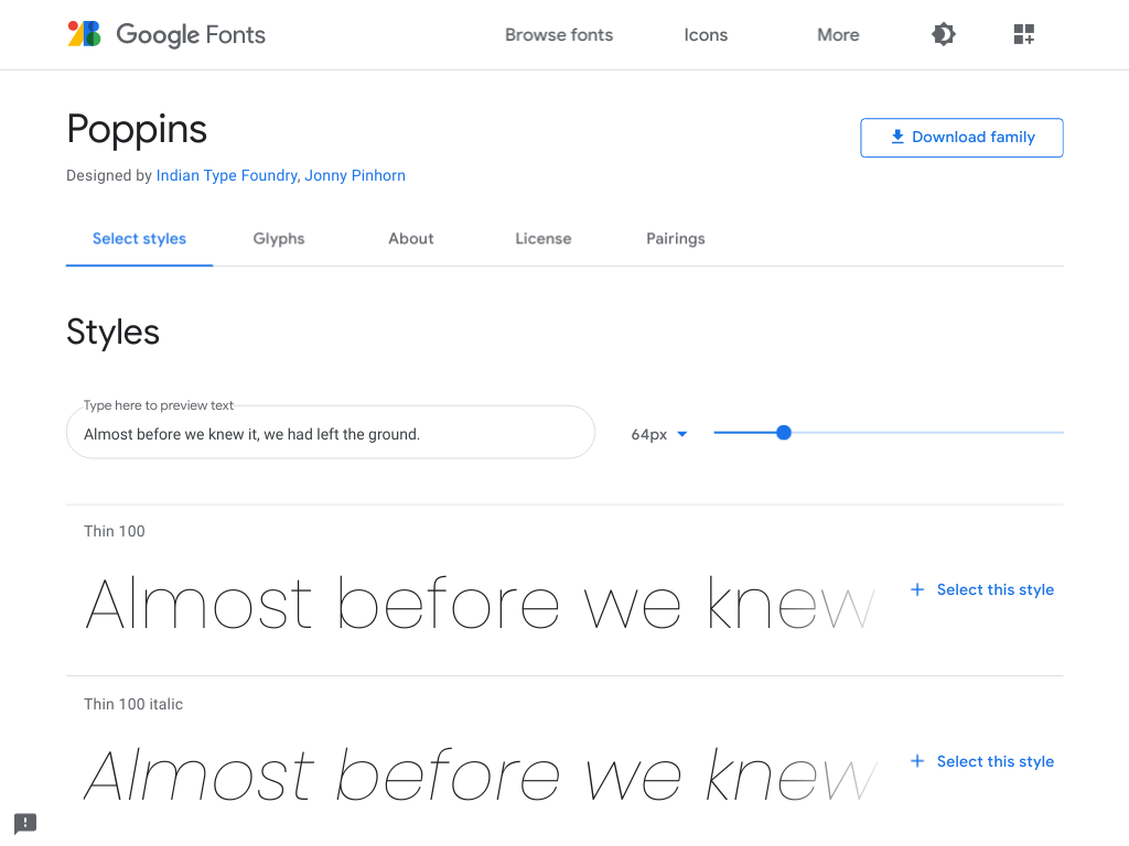
Poppins – Google Fonts
Posted by jpluimers on 2024/06/03
A while ago, I bumped into a page that at first thought was using the Century Gothic font, later the Futura (which has many digitisations), Twentieth Century, and ITC Avant Garde fonts, but instead of older, it was newer: it was a new font I had not seen yet (it’s been quite a few decades I have been outside the font industry).
It’s [Wayback/Archive.is] Poppins, is open source ([Wayback/Archive.is] itfoundry/Poppins: Poppins, a Devanagari + Latin family for Google Fonts.) and has both Latin and Devanagari scripts.
The initial confusion isn’t a coincidence, as Poppins builds on the geometric sans serif typefaces that evolved from 1920’s modernism in Europe.
I love it!
From the git repository:
During the 1920s, Central European type foundries joined the modernists movements in art and design. Modernism was truly international in scope; only three years after the founding of the German Bauhaus school, several of its painting instructors were already exhibiting their work in Calcutta.
Geometric sans serif typefaces have been a popular design element ever since these actors took to the world’s stage. Poppins is one of the newest comer to this long tradition. An open source family supporting both Devanagari and Latin, this typeface is an internationalist take on the geometric sans genre. Many of the Latin glyphs — the ampersand, for instance — are far more constructed and rationalist than in previously released geometric typefaces. Poppins’s Devanagari design is particularly new. It is likely the first-ever large Devanagari family in this style that has been brought to market.
The Poppins family includes five weights, from Light through Bold. Each font includes 1014 glyphs, including all of the unique conjunct forms necessary for typesetting Indian languages like Hindi, Marathi, Nepali, etc. Just like the Latin glyphs, the Devanagari forms in Poppins are based pure geometry (particularly circles). Poppins’s letters are practically monolinear, although optical corrections have been applied to stroke joints where necessary, to maintain an even colour in text. The Devanagari base character height and the Latin ascender height are equal; Latin capital letters are shorter than the Devanagari characters, and the Latin x-height is set rather high.
The Devanagari glyphs in Poppins were designed by Ninad Kale. The Latin is from Jonny Pinhorn. The Indian Type Foundry first published Poppins in 2014.
Picture of the archived [Wayback/Archive.is] Poppins – Google Fonts page:
–jeroen
Share this:

Posted in Font, Power User, Typography | Leave a Comment »
Legacy Windows: Why are console windows limited to Lucida Console and raster fonts? – The Old New Thing
Posted by jpluimers on 2022/08/15
I think this holds to or maybe even including Windows Vista: [Wayback] Why are console windows limited to Lucida Console and raster fonts? – The Old New Thing
The workaround is in KB247815.
Luckily, many old KB articles are still in the BetaArchive (see the blog post Source: Missing a KB article? Try the Microsoft KB Archive – BetaArchive Wiki last month), including [Wayback/Archive.is] Microsoft KB Archive/247815 – BetaArchive Wiki
Windows NT 4 / Windows 2000: Necessary criteria for fonts to be available in a command window
…
An unsupported work around is available by adding the following font specific entry:
Add a String Value
Name=00
Data=“Font Name” (without “”)Into the following registry:
HKLM\Software\Microsoft\WindowsNT\CurrentVersion\Console\TrueTypeFontThe name needs to be incrimented with “
0” for each additional font. The Data entry needs to match the font’s entry in the following registry location:
HKLM\Software\Microsoft\WindowsNT\CurrentVersion\Fonts
Via: [Wayback/Archive.is] Hack does not show up in the font list for Windows command-prompt · Issue #147 · source-foundry/Hack
–jeroen
Share this:
Posted in Font, Lucida Console, Power User, Programmers Font, Windows | Leave a Comment »
