The Wiert Corner – irregular stream of stuff

Jeroen W. Pluimers on .NET, C#, Delphi, databases, and personal interests

  • My badges

  • Twitter Updates

  • My Flickr Stream

  • Pages

  • All categories

  • Enter your email address to subscribe to this blog and receive notifications of new posts by email.

    Join 4,229 other subscribers

Archive for the ‘UI Design’ Category

The Secret of Great Gradient – UX Planet

Posted by jpluimers on 2019/12/09

Gradients work best when “Inspired by Nature”, even if you live in the city.

–jeroen

Read the rest of this entry »

Posted in Development, Power User, Software Development, UI Design | Leave a Comment »

Practical Color Theory for People Who Code

Posted by jpluimers on 2018/06/18

Recommented reading and playing: [Archive.isPractical Color Theory for People Who Code which is not just about the colour wheel, but also about:

  • desaturation
  • mixing
  • contrast for tints and shades

Oh: don’t forge the “Party Mode” (:

–jeroen

PS:


Posted in Color (science), Color (software development), Development, LifeHacker, Power User, science, Software Development, UI Design | Leave a Comment »

Some links and references to IBM CUA: Common User Access which defines a lot of the UIs and UX we still use.

Posted by jpluimers on 2016/02/04

Back in the late 80s and early 90s of last century, engineers Richard E. Berry, Cliff J. Reeves set a standard that still influences the user interfaces and user experience of today: the IBM Common User Access.

I mentioned CUA a few times before, but since an old client of mine managed to throw away their paper originals in a “we don’t need that old stuff any more as we are now all digital” frenzy, I wanted to locate some PDFs. And I promised to write more about CUA.

If anyone has printed versions of the non-PDF documents below, please donate them to aek at bitsavers.org or scanning at archive.org as they are really hard to get.

A few search queries I used:

The PDFs I think are most interesting:

Read the rest of this entry »

Posted in BitSavers.org, Development, History, IBM SAA CUA, Keyboards and Keyboard Shortcuts, Power User, Software Development, UI Design, Usability, User Experience (ux) | 3 Comments »

Paletton and Kuler: very useful for creating colour palettes (via G+ Nick Butcher / Marie Schweiz)

Posted by jpluimers on 2014/08/29

Combile Paletton and Kuler and off you go!

Nick Butcher: Have found this site useful for creating colour palettes. Paletton – The Color Scheme Designer

Marie Schweiz: https://kuler.adobe.com and you can get the swatches :)

#Color

Thanks Nick Butcher and Marie Schweiz.

–jeroen

via: Have found this site useful for creating colour palettes..

Posted in Development, Power User, Software Development, UI Design, User Experience (ux) | Tagged: , | Leave a Comment »

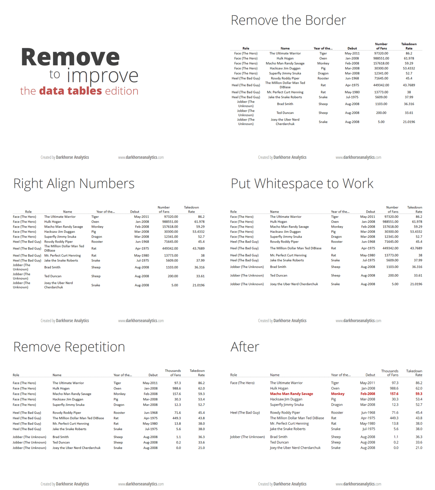
André Vatter – Google+ – Wie Tabellen eigentlich aussehen sollten: 

Posted by jpluimers on 2014/04/03

Below is how tables should look like.

Thanks Thomas Mueller (dummzeuch) for pointing me to André Vatter – Google+ – Wie Tabellen eigentlich aussehen sollten: .

–jeroen

André Vatter - Google+ - Wie Tabellen eigentlich aussehen sollten: 

Posted in Development, Software Development, UI Design | Leave a Comment »

 
%d bloggers like this: