


The origin of the space between in the “Heineken Brouwerij” logo of the Amsterdam brewery
Posted by jpluimers on 2018/04/02
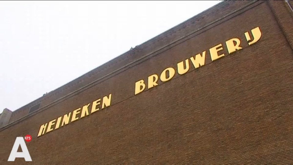
On the very early adoption of the spacing in the typography:
Ooit wel eens stilgestaan bij het iets te grote gat tussen de woorden Heineken en Brouwerij op de Stadhouderskade? Of waarom de belettering op bruggen in de stad zo ‘Amsterdams’ aandoet? Waarschijnlijk niet. Typograaf Bas Jacobs deed dat wel. Zijn ontdekkingen bundelde hij in een speciale toeristengids.
A small book (just EUR 15) tells you more about his Amsterdam findings: Safari Typo Amsterdam
Source: [WayBack] Waar komt Heineken spatie Brouwerij eigenlijk vandaan? – AT5: de nieuwszender van Amsterdam en omgeving
–jeroen

Leave a comment