Improving your designs with tactics instead of talent: weight and colour. But be careful with the variation in meanings of colours for different cultures and mind about colour-blind people. Also ensure information workers can optimise your UI for information density.
Designing for a good user experience is hard, especially to programmers. So if you are a programmer, please read, let them sink in, rinse, repeat the below linked articles multiple times. Being ~15 years old, they are still so very relevant:
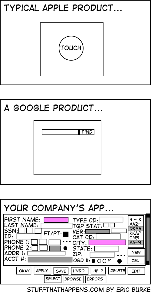
It is really disappointing that most customers are looking for solutions that don’t fall into the categories: “search” and “switch on/off”.
Developer: “So which of the fields do you actually need in this screen?”
Customer. “All of them!”
Developer: “Well, that will make the screen pretty cluttered information”.
Customer: “And please allow to add more easily whenever we need them.”
Developer: “That would be hard to achieve unless you exchange all your monitors to bigger ones.”
Customer: “OK, then. Can you make it work on my Apple Watch?”
I very much can relate to this: somehow a lot of business driven applications have cramped user interfaces that are very hard to use because the overwhelming number of UI controls and features per screen.
This holds even for web applications.
Let’s hope this will slowly change for the better over time.
An item that provides click-through is one that a user can activate with one click, even though the item is in an inactive window. (To activate an item that does not support click-through, the user must first make the containing window active and then click the item.) Although click-through can make some user tasks easier, it can also confuse users if they click items unintentionally.
Click-through is not a property of a class of controls; any control, including toolbar items, can support click-through. This also means that you can support click-through for any subset of items; you don’t have to choose between supporting click-through for all items in a window or none. Follow the guidelines in this section so that you can support click-through when it’s appropriate.
Avoid providing click-through for an item or action whose result might be dangerous or undesirable. Specifically, avoid enabling click-through for an item that:
Performs a potentially harmful action that users can’t cancel (for example, the Delete button in Mail)
Performs an action that is difficult or impossible to cancel (such as the Send button in Mail)
Dismisses a dialog without telling the user what action was taken (for example, the Save button in a Save dialog that overwrites an existing file and automatically dismisses the dialog)
Removes the user from the current context (for example, selecting a new item in a Finder column that changes the target of the Finder window)
Clicking in any one of these situations should cause the window that contains the item to be brought forward, but no other action to be taken.
In general, it’s safe to provide click-through for an item that asks the user for confirmation before executing, even if the command ultimately results in destruction of data. For example, you can provide click-through for a delete button if you also make sure to give users the opportunity to cancel or confirm the action before it proceeds.
Think twice before supporting click-through for items that don’t provide confirmation feedback. Specifically, consider how dangerous the action might be, and determine how difficult it will be for the user to undo the action after it’s performed. For example, the Mail Delete button does not provide click-through because it deletes a message without asking for confirmation, which is a potentially harmful action that can be difficult to undo. On the other hand, click-through for the New button in Mail is fine because its resulting action is not harmful and is easy to undo.
Ensure that items that don’t support click-through appear disabled when their window is inactive. The disabled appearance helps users understand that these controls are unavailable. For example, the Delete and Mark as Junk buttons in the inactive Mail window shown below don’t support click-through.
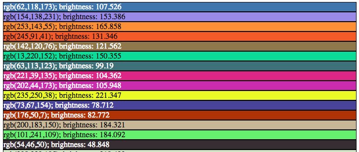
Choosing label colours other than black or white is like making a dynamic mouse cursor that inverts the colours underneath it: it fails horribly in the low contrast regions, and looks very strange on pink-noise backgrounds.
This approach is uses black and white depending on the perceived brightness:
What would data viz be without labels? Just viz, that’s what. This guide aimed at web designers discusses how to choose a label text color with enough contrast.
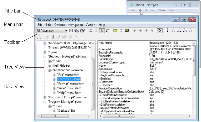
Inspect (Inspect.exe) is a Windows-based tool that enables you select any UI element and view the element’s accessibility data. You can view Microsoft UI Automation properties and control patterns, as well as Microsoft Active Accessibility properties. Inspect also enables you to test the navigational structure of the automation elements in the UI Automation tree, and the accessible objects in the Microsoft Active Accessibility hierarchy.
Inspect is installed with the Windows Software Development Kit (SDK) for Windows 8. (It is also available in previous versions of Windows SDK.) It is located in the \bin\<platform> folder of the SDK installation path (Inspect.exe).


 The Wiert Corner - irregular stream of stuff