Archive for the ‘User Experience (ux)’ Category
Posted by jpluimers on 2026/03/25
[WaybackSave/Archive] Automation can’t fix broken security basics – Help Net Security reveals nothing new: like in many places, automation isn’t the solution for bad processes or bad behaviour. Automation just assists getting things done (even in security), only marginally leading people to getting these things right in addition to done.
Leadership often focuses on broad resilience goals while the day-to-day work that supports them remains inconsistent and underfunded.
This is especially true when the day-to-day activities mainly consists clicking on links and other user-interface elements.
Yes, dark patterns are being used by adversaries, but a lot of day to day user experiences are based on dark patterns.
Improve those experiences by designing better processes amended by better automation, not the other way around.
Oh, and get your foundations right. For example by having processes in place that ease timely patching, even if that requires deployment on fridays.
--jeroen
Posted in Dark Pattern, Deployment, Development, DevOps, Infrastructure, Software Development, UI Design, User Experience (ux) | Leave a Comment »
Posted by jpluimers on 2026/01/14
I had to pick up a package keying in a 6 digit code using the below PostNL UI.
It was horrible. Don’t implement your numeric input UI like this: use a telephone keypad like or calculator numpad like keypad UI.
Read the rest of this entry »
Posted in Development, Software Development, UI Design, User Experience (ux) | Leave a Comment »
Posted by jpluimers on 2025/09/25
I hope someone has also archived all these in the Internet Archive as this is a great collection of historic material: [WaybackSave/Archive] GitHub – gingerbeardman/apple-human-interface-guidelines: Apple Human Interface Guidelines, et al.
If you have more of them: add them via a pull-request.
Related: [Wayback/Archive] Making It Macintosh: The Macintosh Human Interface Guidelines Companion : Apple : Free Download, Borrow, and Streaming : Internet Archive
A client that went belly up in the early 1990s had all these and similar books. In retrospect, I though have found a way to obtain them but back then I didn’t value the uniqueness of them enough and didn’t have the storage space for it (I lived in a 30m² apartment).
Read the rest of this entry »
Posted in //e, 68k, Apple, Apple Lisa, Classic Macintosh, Development, Hardware, History, Mac, NeXT, Power User, Software Development, User Experience (ux) | Leave a Comment »
Posted by jpluimers on 2025/09/19
In a German thread, Kristian Köhntopp perfectly explained why I too always use light mode, so I put the English translations here:
- Dark mode is a strain on the eyes and useless.
- Specific: In darkness (and in dark mode) your pupils widen, the diaphragm opens. This reduces the depth of field and the eye muscles have to do more work and precision when focusing.
- Conversely, with light and a bright background you have a smaller pupil, a small aperture and more depth of field. This means that everything is automatically sharp, even if the eye has not readjusted.
The German thread:
Read the rest of this entry »
Posted in accessibility (a11y), Conference Topics, Conferences, Development, Event, LifeHacker, User Experience (ux) | Leave a Comment »
Posted by jpluimers on 2025/06/03
Posted in Conference Topics, Conferences, Dark Pattern, Development, Event, Software Development, Testing, User Experience (ux) | Tagged: 2020, 2021, babyfur, comedy, crying, duet, firstpost, foryou, foryoupage, funny, fyp, newyear, RareAesthetic, viral, Welcome2021 | Leave a Comment »
Posted by jpluimers on 2025/04/15
The problem with error messages is that they just displays errors as a fact without providing the user of future steps.
Offer them with a helpful, actionable message instead.
Not just for people with a visual impairment, I added readable text to the image below.
Read the rest of this entry »
Posted in accessibility (a11y), Conference Topics, Conferences, Development, Event, Software Development, Usability, User Experience (ux) | Tagged: HelpMessages | Leave a Comment »
Posted by jpluimers on 2025/03/05
I originally searched for the tables below to see if I could get the visualisations of TeX and LaTeX right for infinite loop in “LaTeX: A Document Preparation System” by Leslie Lamport, printed in 1994..
Didn’t work, neither did using plain html super and subscript. The only thing that worked was using CSS styles (I chose to embed them, as separate CSS files are a huge premium over the WordPress plan), which also preserves actual meaning for screen readers:
Read the rest of this entry »
Posted in accessibility (a11y), CSS, Development, HTML, Power User, Software Development, Unicode, URL Encoding, User Experience (ux), Web Development | Leave a Comment »
Posted by jpluimers on 2025/02/27
A long while ago, I participated in a Twitter thread that started with a translation of some important accessibility posts by Bianca Prins, then extended it to the concept to archivability:
[WayBack] Thread by @jpluimers: “I am going to first translate this, then extend this to archivability…. @jpluimers […]” #UXdesign #accessibility.
TL;DR
Let’s go
Read the rest of this entry »
Posted in ArchiveTeamWarrior, Conference Topics, Conferences, Development, Event, Internet, InternetArchive, Power User, Software Development, Usability, User Experience (ux), WayBack machine | Tagged: accessibility, toegankelijkheid, UXdesign | Leave a Comment »
Posted by jpluimers on 2024/11/05
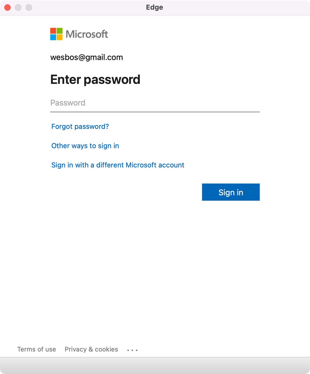
Edge browser Window without address bar of a Microsoft logon page for wesbos@gmail.com not indicating what the logon is for.
[Wayback/Archive] Thread by @wesbos on Thread Reader App
Every single app that uses a popup to sign in needs to stop hiding the address bar.
There is no way to test if its a legit website and 1Password doesn’t work
Without this, your logon borders on a dark pattern which can easily be abused by scammers.
Basically there are three things to make very clear for any logon page belonging to an actually executable: what you are actually logging on to, for and with.
Preferably your application also makes very clear that the logon page actually belongs to the application executable (despite users can figure out the application itself through for instance the Task Manager, or Process Explorer).
For web based logon, this last step is not possible, so for that it is really important to show the URL and the relation of the URL to the application (especially if you use a 3rd party logon like a Microsoft account – formerly Microsoft Passport, Google Account or Facebook account like was popular in OpenID heydays decade surrounding 2010).
Tweet:
Read the rest of this entry »
Posted in Dark Pattern, Development, Software Development, User Experience (ux), Web Development, Windows Development | Leave a Comment »


