The Wiert Corner – irregular stream of stuff

Jeroen W. Pluimers on .NET, C#, Delphi, databases, and personal interests

  • My badges

  • Twitter Updates

  • My Flickr Stream

  • Pages

  • All categories

  • Enter your email address to subscribe to this blog and receive notifications of new posts by email.

    Join 1,860 other subscribers

Archive for June, 2024

Stembureau’s Lisse EU verkiezingen 2024 – Google Maps

Posted by jpluimers on 2024/06/06

Even een kaartje want de gemeente heeft alleen een lijst adressen en omdat we daar relatief nieuw zijn en ik straatnamen nauwelijks kan onthouden (ik ben meer visueel ingesteld): [Archive] Stembureau’s Lisse EU verkiezingen 2024 – Google Maps.

In het kader van “eventual consistency” zijn sommige markeringen nog blauw in plaats van rood (ik heb ze allemaal rood gemaakt, maar Google loopt daarin bij tonen wat achter).

De bron is [Wayback/Archive] Gemeente Lisse: Stembureaus:

Read the rest of this entry »

Posted in LifeHacker, Power User | Leave a Comment »

Fixing the GitHub gist CSS so the editor uses more than 25% of my screen estate

Posted by jpluimers on 2024/06/05

Two years ago I asked [Wayback/Archive] Jeroen Wiert Pluimers on Twitter: “Is there a way to make the @github gist text editor wider and taller? Right now (at 1920×1200) it uses about half the screen width and screen height. That wastes about 25% of screen estate. “.

I still have to figure out how to fix the height, but the width was relatively easy back then. Hopefully this CSS fix still works today.

In the mean time [Wayback/Archive] Add full height gist creation by xthexder Β· Pull Request #68 Β· xthexder/wide-github: Conversation permanently fixed my problem.

[Wayback/Archive] Jeroen Wiert Pluimers on Twitter: “I fixed the width by modifying .container-lg and changing max-width from 1018px to 95%.”

Until GitHub fixes it themselves, I started with this fix in the extension [Wayback/Archive] Stylus – Chrome Web Store:

Read the rest of this entry »

Posted in CSS, Development, DVCS - Distributed Version Control, gist, GitHub, HTML, Software Development, Source Code Management, Web Development | Leave a Comment »

Tranen van emoties: opnieuw op het podium in ‘t Onderdak in Sassenheim. Dank Cresendo, Willem, Micheline en Jos!

Posted by jpluimers on 2024/06/04

[Wayback/Archive] Thread by @jpluimers on Thread Reader App – Thread Reader App

Moe, voldaan en onder de paracetamol ben ik dankbaar dat @CrescendoSassem me, ondanks mijn beperkingen, 2 maanden terug vroeg een percussieplek in te vullen.

Afgelopen zaterdag in totaal 4 uur met ze op het podium geweest met Shaffy & Brass.

Het ging boven verwachting.

1/

Read the rest of this entry »

Posted in About, LifeHacker, Music, Personal, Power User | Leave a Comment »

maartensukel/example-textual-classification-citizen-reports: Example of a simple textual classification using TF-IDF and LR.

Posted by jpluimers on 2024/06/04

Cool technology:

[Wayback/Archive] maartensukel/example-textual-classification-citizen-reports: Example of a simple textual classification using TF-IDF and LR.

The classification is done by using a TF-IDF (Term Freuqency – Inversed document frequency) as representation for the text and a logistic regression to classify the text. Optimal hyperparameters for the dataset are found using a gridsearch.

Author:Β [Wayback/Archive] Maarten Sukel (@MaartenSukel) / Twitter

The source is based on Python Pandas and sci-kit learn (also known as sklearn).

Read the rest of this entry »

Posted in Development, Pandas, Python, Scripting, Software Development | Leave a Comment »

Google Search Location Changers for Chrome and Firefox (via Henk van Ess)

Posted by jpluimers on 2024/06/03

Very useful Web Browser extensions (which you can also use in Edge, see [Wayback/Archive] Add, turn off, or remove extensions in Microsoft Edge – Microsoft Support).

Via [Wayback/Archive] πš‘πšŽπš—πš” πšŸπšŠπš— 𝚎𝚜𝚜 on X: “Sick of seeing the web just locally when using Google? Use Google Search location changer to end this problem. Chrome: … Firefox: …”

--jeroen

Posted in Chrome, Chrome, Firefox, Google, Power User, Web Browsers | Leave a Comment »

Poppins – Google Fonts

Posted by jpluimers on 2024/06/03

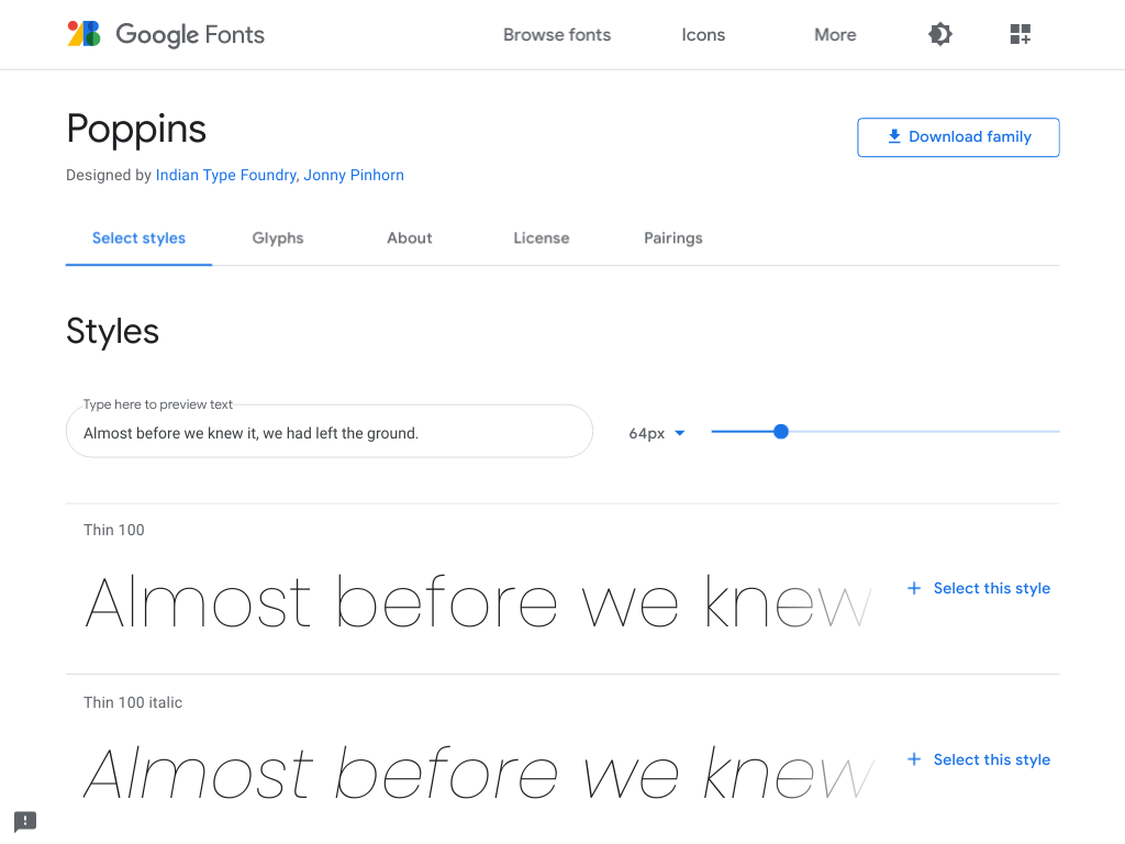
A while ago, I bumped into a page that at first thought was using the Century Gothic font, later the Futura (which has many digitisations), Twentieth Century, and ITC Avant Garde fonts, but instead of older, it was newer: it was a new font I had not seen yet (it’s been quite a few decades I have been outside the font industry).

It’s [Wayback/Archive.is] Poppins, is open source ([Wayback/Archive.is] itfoundry/Poppins: Poppins, a Devanagari + Latin family for Google Fonts.) and has both Latin and Devanagari scripts.

The initial confusion isn’t a coincidence, as Poppins builds on the geometric sans serif typefaces that evolved from 1920’s modernism in Europe.

I love it!

From the git repository:

During the 1920s, Central European type foundries joined the modernists movements in art and design. Modernism was truly international in scope; only three years after the founding of the German Bauhaus school, several of its painting instructors were already exhibiting their work in Calcutta.

Geometric sans serif typefaces have been a popular design element ever since these actors took to the world’s stage. Poppins is one of the newest comer to this long tradition. An open source family supporting both Devanagari and Latin, this typeface is an internationalist take on the geometric sans genre. Many of the Latin glyphs β€” the ampersand, for instance β€” are far more constructed and rationalist than in previously released geometric typefaces. Poppins’s Devanagari design is particularly new. It is likely the first-ever large Devanagari family in this style that has been brought to market.

The Poppins family includes five weights, from Light through Bold. Each font includes 1014 glyphs, including all of the unique conjunct forms necessary for typesetting Indian languages like Hindi, Marathi, Nepali, etc. Just like the Latin glyphs, the Devanagari forms in Poppins are based pure geometry (particularly circles). Poppins’s letters are practically monolinear, although optical corrections have been applied to stroke joints where necessary, to maintain an even colour in text. The Devanagari base character height and the Latin ascender height are equal; Latin capital letters are shorter than the Devanagari characters, and the Latin x-height is set rather high.

The Devanagari glyphs in Poppins were designed by Ninad Kale. The Latin is from Jonny Pinhorn. The Indian Type Foundry first published Poppins in 2014.

Picture of the archived [Wayback/Archive.is] Poppins – Google Fonts page:
–jeroen

Posted in Font, Power User, Typography | Leave a Comment »