


Indeed, many free fonts have improved a lot over the years.
Taking A Second Look At Free Fonts | Smashing Magazine.
–jeroen
via: JWildeBoer on G+.
Posted by jpluimers on 2014/03/13
Indeed, many free fonts have improved a lot over the years.
Taking A Second Look At Free Fonts | Smashing Magazine.
–jeroen
via: JWildeBoer on G+.

Posted in Font, Power User, Programmers Font | Leave a Comment »
Posted by jpluimers on 2014/02/17
Nice: Google Fonts. They started their own Font CDN.
Posted in Font, Power User | Leave a Comment »
Posted by jpluimers on 2014/01/31
Yes, I’m a font addict (:
K-Type Independent Type Foundry » Freebies.
Most of their fonts have at least one style that is a Freebie for non-commercial use too, a great way to experiment with some of their fonts: Read the rest of this entry »
Posted in About, Font, LifeHacker, Personal, Power User | Leave a Comment »
Posted by jpluimers on 2013/05/08
")
Lucida Console Sample (thanks Wikimedia!)
I’m in search to see if there is a better programmers font than the monospaced Lucida Console mainly to be used in Visual Studio, Delphi, the Windows console, Xcode and Eclipse. What I love about Lucida Console design is the relatively large x-height combined with a small leading (often called “line height”). This combines very readable text, and a lot of code lines in view. Lucida has two small drawbacks, see the second image at the right:
But, since the font hasn’t been updated for a very long time, lots of Unicode code points that are now in current fonts, are missing from Lucida Console (unless you buy the [Wayback] most recent version that has 666 characters from Fonts.com) Well, there are dozens of monospaced fonts around, so I wonder: which ones do you like? In the mean while, I’m going to do some experimenting with fonts mentioned in these lists:
A few fonts I’m considering (I only want scalable fonts, so raster .fon files are out):
I have tried Adobe Source Code Pro about half a year ago. That didn’t cut it: problem with italics in Delphi, and not enough lines per screen. [Wayback] New Open Source monospaced font from Adobe: Source Code Pro.
–jeroen

Posted in .NET, Adobe Source Code Pro, Apple, Delphi, Delphi 2007, Delphi XE3, Development, Encoding, Font, Lucida Console, Mac, Mac OS X / OS X / MacOS, Power User, Programmers Font, Software Development, Typography, Unicode, Visual Studio 11, Visual Studio 2005, Visual Studio 2008, Visual Studio 2010, Visual Studio and tools, Windows, Windows 7, Windows 8, Windows Server 2008 R2, Windows XP, xCode/Mac/iPad/iPhone/iOS/cocoa | 43 Comments »
Posted by jpluimers on 2013/03/01
A few links I came across recently:
–jeroen
Posted in About, Development, Encoding, EPS/PostScript, Font, internatiolanization (i18n) and localization (l10), Personal, Power User, Programmers Font, Software Development, Unicode | Leave a Comment »
Posted by jpluimers on 2013/01/21
I’m going to try PowerLine.
My story is similar to Les at How Big Is Your Network?.
15 years and still growing
In 1995 I wired the house with thin net coax (10base2 w/ BNC connectors), because it did not require any expensive hubs of the day. Those old wires are still in place. The cable modem connects to a Netgear wireless router with four wired plugs. Two go to computers, one to xbox 360 and forth to Netgear hub 24 10baseT and 1 10Base2 (BNC) ports. Connected to the 24 port hub via cat 5 are another computer, 1 inkjet printer, 1 laser printer and an SMC power line Ethernet adapter. The powerline adapter connects to another SMC adapter and switch in storage building about 100 yards away from the house. This storage building has my old computers, Apple II, C64, Atari , iMac etc. Via the BNC port another 2 computers are connected in other parts of the house. Each room to which the 10base2 cable runs has a 4 port hub with BNC and RJ45 ports to allow for cat 5 connections. Last there is a laptop and an desktop in the house connected to the wireless router.
—Guest Les
 I built my first network in my first rental home: a 2-room apartment with a living/study/kitchen/balcony of about 38 m^2, a bedroom of about 16 m^2 and a bathroom/shower of about 4 m^2. A crazy place (for one because the landlord choose to install 16 A D-type fuse in the main fuse box delivering power to multiple 25 A fuses in the apartment, so I once had the main fuse explode).
It was the place where I established my first company, had a BBS called The White House (which was in part true, as most of the house was indeed white), frequented the comp.font newsgroup (as I landed a PostScript/TrueType digitizing font job in about 1990) and comp.lang.pascal group, and was public domain author.
Having a single computer multitasking BBS, work and storage using DESQview (video) wasn’t the best. So when I earned enough money using Turbo Pascal 6 and Turbo Pascal for Windows, and with student editions of DOS 5.0, Windows 3.0, and Netware 3.x I built my own network. Read the rest of this entry »

Posted in About, Font, Personal, Power User | 2 Comments »
Posted by jpluimers on 2012/10/23
Reminder to self:
Source Sans Pro v 1.038 is released. Now with small capitals (and more)! GitHub: https://github.com/adobe/source-sans-pro/downloads … SourceForge: https://sourceforge.net/projects/sourcesans.adobe/ …
With Source Sans Pro goes the – also free – Source Code Pro.
All fonts come in OTF and TTF format. Since there are quite a few differences between OTF and TTF, I’d use OTF over TTF whenever possible.
I also found a great interview with Paul D Hunt, the main designer of these fonts, and his Pilcrow Pabulum blog.
–jeroen
via Twitter / AdobeType: Source Sans Pro v 1.038 is ….
Posted in Font, Power User | Leave a Comment »
Posted by jpluimers on 2012/09/30
Last week, Adobe launched the monospaced Open Source font [Wayback] Source Code Pro designed by [Wayback] Paul D. Hunt.
It is a follow-up of the (also designed by Paul) [Wayback] Source Sans Pro family of Open Source Fonts which got released early last month.
I did a quick look to see if it would get the same number of vertical lines as Lucida Console does at 8 points.
Too bad, as the general font design is awesome.
One big missing thing is italic/oblique, which is often used in code editors. Hopefully a future version will include those.
For embedding source code examples in documentation, it is very legible, so I will keep it installed on my system.
You can try Source Code Pro yourself as well: it is available [Wayback] on SourceForge – that also hosts [Wayback] Open@Adobe – [Wayback] on GitHub, where you can fork it, as well as [Wayback] on Google Web Fonts, [Wayback] on typekit, and [Wayback] on WebINK.
–jeroen
via: [Wayback] Announcing Source Code Pro « Typblography.
Posted in Adobe Source Code Pro, Font, Lucida Console, Power User, Programmers Font, Typography | Tagged: adobe font, design, documentation, editors, font design, fonts, google, open source, software, sourceforge, technology, vertical lines, web fonts | 2 Comments »
Posted by jpluimers on 2012/06/25
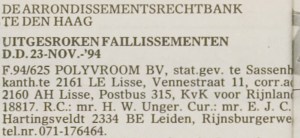
19941123 – Polyvroom – Failissement
Historically I have an interest in digital typography: in the early 90s, I used to freelance for Polyvroom in Lisse (that went belly up on 19941123, the remains bought by Trip Productions) that digitized (together with the still existing Visualogik) many of the TrueType and PDF fonts for Mecanorma and Monotype (now acquired by Agfa and – after Agfa acquired ITC as well – renamed into Monotype Imaging).
I even have the whole set of Lucida Fonts that beta testers got for testing a Windows version (I think it is Windows 95, but it might be earlier as TrueType was introduced in Windows 3.1). (sidenote: most of the Lucida fonts got designed by Kris Holmes, the rest by Charles Bigelow, so now you know where Bigelow and Holmes stems from; they don’t run their own site any more).
There are many good articles on screen fonts, but that’s not the point of this post, maybe in a future post.
Historically, I kept an eye on the Microsoft Typography website (I have backups from early this century) because of the information quality and cross platform information.
Back in the default.asp era, they had a few pages with fonts for certain platforms:
Since then, they redesigned the site, and now their http://www.microsoft.com/typography/fonts fonts page is aspx based, and contains lists with links for:
All individual fonts referred on those links (like Vladimir Script) have a sample as well.
The fonts page also contains a few bonus links:
The really cool thing is that they kept the old links, thereby preventing link rot. Well done!
Another cool thing is that the vast majority of Ubuntu users have the mscorefonts installed. I learned something new there too!
Now they should include some more information on the Metro design language, that is heavily based on the use of typography.
One of the fonts that has Metro like look and is available in many Microsoft products is Century Gothic. I love the geometric design of it!
–jeroen

Posted in Font, Internet, link rot, Power User, Typography, WWW - the World Wide Web of information | 1 Comment »
Posted by jpluimers on 2012/01/02
When old skool is modern again :)
The last few months, I observe more and more ASCII art, especially on social media like FaceBook, Twitter, etc.
The most recent was this one from our neighbours – thanks guys – (it doesn’t do very good justice to the original, as it needs less linespacing, and works best with an Arial font):
. °.˛*.˛.°★。˛°.★*. * Fijne Kerstdagen en *★* *˛.
. ˛ °_██_*。*./ ♥ \ .˛* .˛. *.★ een geweldig 2012**★ 。
. ˛. (´• ̮•)*˛°*/.♫.♫\*˛.* ˛_Π_____. * * * ★ toegewenst 。
. .°( . • . ) ˛°./• ‘♫ ‘ •\.˛*./______/~\.˛* .。˛ * *★* Someone &
. *(…’•’.. ) *˛╬╬╬╬╬˛°.|田田 |門|╬╬╬╬╬*★★*★ ★ Someone
. ¯˜”*°••°*”˜¯`´¯˜”*°••°*”˜¯ ` ´¯˜”*°´¯˜”*°••°*”˜¯`´¯˜” *
Since many characters are not ASCII at all, maybe Typewriter Art fits better.
Anyway: I like the new revival of these kinds of arts.
They remind being a lot younger and playing around with characters to see what graphical information I could put in a limited space. You can use this to present information too, as [W/A] this progress bar shows how busy the public traffic is.
They also remind me how much real artists can do in little space. Given the limited space especially on Twitter and Mobile Systems, and the common feature among those is still text, ASCII art makes a lot of sense again :)
Some references to give you an idea how bad I was at it, and how good others :)
Check out [Wayback/Archive] http://cd.textfiles.com/hackchronii/VIRUSL4/VIRUSL4.46 and search for “Pluimers” (sitenote: I was nicknamed by the chinese cook in the restaurant kitchen I worked a few years before that, though the cook pronounced “Charlie” as “Cha-li”, and I nicked it to Charly to avoid conflicts).
A bit later I condensed it a bit (look for “rulfc1” at [Wayback/Archive] http://www.nic.funet.fi/pub/msdos/Info/info-ibmpc). [Wayback/Archive] Others were way better at Email Art and [not archived] Signature Art than I was.
Those were days where you would mostly communicate with text. And even that wasn’t a long time ago when you imagine that the oldest known form of Typewriter Art is from 1898!
--jeroen
Posted in About, ASCII art / AsciiArt, Font, Fun, Personal, Power User | 2 Comments »
