The Wiert Corner – irregular stream of stuff

Jeroen W. Pluimers on .NET, C#, Delphi, databases, and personal interests

  • My badges

  • Twitter Updates

  • My Flickr Stream

  • Pages

  • All categories

  • Enter your email address to subscribe to this blog and receive notifications of new posts by email.

    Join 1,860 other subscribers

Archive for the ‘Typography’ Category

Poppins – Google Fonts

Posted by jpluimers on 2024/06/03

A while ago, I bumped into a page that at first thought was using the Century Gothic font, later the Futura (which has many digitisations), Twentieth Century, and ITC Avant Garde fonts, but instead of older, it was newer: it was a new font I had not seen yet (it’s been quite a few decades I have been outside the font industry).

It’s [Wayback/Archive.is] Poppins, is open source ([Wayback/Archive.is] itfoundry/Poppins: Poppins, a Devanagari + Latin family for Google Fonts.) and has both Latin and Devanagari scripts.

The initial confusion isn’t a coincidence, as Poppins builds on the geometric sans serif typefaces that evolved from 1920’s modernism in Europe.

I love it!

From the git repository:

During the 1920s, Central European type foundries joined the modernists movements in art and design. Modernism was truly international in scope; only three years after the founding of the German Bauhaus school, several of its painting instructors were already exhibiting their work in Calcutta.

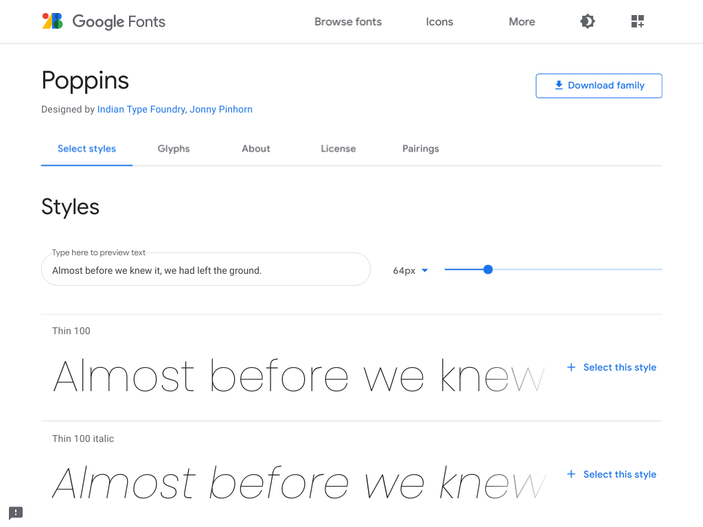
Geometric sans serif typefaces have been a popular design element ever since these actors took to the world’s stage. Poppins is one of the newest comer to this long tradition. An open source family supporting both Devanagari and Latin, this typeface is an internationalist take on the geometric sans genre. Many of the Latin glyphs — the ampersand, for instance — are far more constructed and rationalist than in previously released geometric typefaces. Poppins’s Devanagari design is particularly new. It is likely the first-ever large Devanagari family in this style that has been brought to market.

The Poppins family includes five weights, from Light through Bold. Each font includes 1014 glyphs, including all of the unique conjunct forms necessary for typesetting Indian languages like Hindi, Marathi, Nepali, etc. Just like the Latin glyphs, the Devanagari forms in Poppins are based pure geometry (particularly circles). Poppins’s letters are practically monolinear, although optical corrections have been applied to stroke joints where necessary, to maintain an even colour in text. The Devanagari base character height and the Latin ascender height are equal; Latin capital letters are shorter than the Devanagari characters, and the Latin x-height is set rather high.

The Devanagari glyphs in Poppins were designed by Ninad Kale. The Latin is from Jonny Pinhorn. The Indian Type Foundry first published Poppins in 2014.

Picture of the archived [Wayback/Archive.is] Poppins – Google Fonts page:

–jeroen

Posted in Font, Power User, Typography | Leave a Comment »

The origin of the space between in the “Heineken Brouwerij” logo of the Amsterdam brewery

Posted by jpluimers on 2018/04/02

On the very early adoption of the spacing in the typography:

Ooit wel eens stilgestaan bij het iets te grote gat tussen de woorden Heineken en Brouwerij op de Stadhouderskade? Of waarom de belettering op bruggen in de stad zo ‘Amsterdams’ aandoet? Waarschijnlijk niet. Typograaf Bas Jacobs deed dat wel. Zijn ontdekkingen bundelde hij in een speciale toeristengids.

A small book (just EUR 15) tells you more about his Amsterdam findings: Safari Typo Amsterdam

Source: [WayBackWaar komt Heineken spatie Brouwerij eigenlijk vandaan? – AT5: de nieuwszender van Amsterdam en omgeving

–jeroen

Posted in Font, History, Typography | Leave a Comment »

Recommende for font enthousiast: Bigelow & Holmes – How and Why We Designed Lucida

Posted by jpluimers on 2014/12/21

I absolutely love the Lucida family of fonts, and wrote about Bigelow and Holmes before in my font and typography categories.

So I’m glad I bumped (thanks Kristian!) into the Bigelow and Holmes blog (and Lucida fonts store), that recently published this article:

Bigelow & Holmes – How and Why We Designed Lucida.

Recommended reading for font lovers.

And while we are at it, a few more interesting reads on typography history:

–jeroen

Posted in Font, Power User, Typography | Leave a Comment »

Why IKEA’s font switch from Futura to Verdana mattered (via: National Post)

Posted by jpluimers on 2014/08/14

The point made by Simson Garfield below reminds me I haven’t been at IKEA for a long long while (:

Verdana was everywhere, and now it was in one more place. It was becoming a non-font that we don’t even register. Which is precisely why it was so effective, and exactly why it was chosen.

--jeroen

via: Why IKEA’s font switch from Futura to Verdana mattered | National Post.

PS: for people that also missed it and want to see the differences:

Read the rest of this entry »

Posted in About, Font, IKEA hacks, LifeHacker, Personal, Power User, Typography | Leave a Comment »

What programmers font (monospaced!) do you like best?

Posted by jpluimers on 2013/05/08

Lucida Console Sample (thanks Wikimedia!)

Lucida Console Sample (thanks Wikimedia!)

I’m in search to see if there is a better programmers font than the monospaced Lucida Console mainly to be used in Visual Studio, Delphi, the Windows console, Xcode and Eclipse. What I love about Lucida Console design is the relatively large x-height combined with a small leading (often called “line height”). This combines very readable text, and a lot of code lines in view. Lucida has two small drawbacks, see the second image at the right:

  • The captial O and digit 0 (zero) are very similar.
  • Some uppercase/lowercase character pairs are alike (because of the large x-height)

But, since the font hasn’t been updated for a very long time, lots of Unicode code points that are now in current fonts, are missing from Lucida Console (unless you buy the [Waybackmost recent version that has 666 characters from Fonts.com) Well, there are dozens of monospaced fonts around, so I wonder: which ones do you like? In the mean while, I’m going to do some experimenting with fonts mentioned in these lists:CcKkOoSsUuVvWwXxZz are much alike.

A few fonts I’m considering (I only want scalable fonts, so raster .fon files are out):

I have tried Adobe Source Code Pro about half a year ago. That didn’t cut it: problem with italics in Delphi, and not enough lines per screen. [WaybackNew Open Source monospaced font from Adobe: Source Code Pro.

–jeroen

Posted in .NET, Adobe Source Code Pro, Apple, Delphi, Delphi 2007, Delphi XE3, Development, Encoding, Font, Lucida Console, Mac, Mac OS X / OS X / MacOS, Power User, Programmers Font, Software Development, Typography, Unicode, Visual Studio 11, Visual Studio 2005, Visual Studio 2008, Visual Studio 2010, Visual Studio and tools, Windows, Windows 7, Windows 8, Windows Server 2008 R2, Windows XP, xCode/Mac/iPad/iPhone/iOS/cocoa | 43 Comments »

New Open Source monospaced font from Adobe: Source Code Pro

Posted by jpluimers on 2012/09/30

Last week, Adobe launched the monospaced Open Source font [Wayback] Source Code Pro designed by [WaybackPaul D. Hunt.

It is a follow-up of the (also designed by Paul) [WaybackSource Sans Pro family of Open Source Fonts which got released early last month.

I did a quick look to see if it would get the same number of vertical lines as Lucida Console does at 8 points.

  • Lucida Console: 50 lines
  • Source Code Pro: 40 lines

Too bad, as the general font design is awesome.

One big missing thing is italic/oblique, which is often used in code editors. Hopefully a future version will include those.

For embedding source code examples in documentation, it is very legible, so I will keep it installed on my system.

You can try Source Code Pro yourself as well: it is available [Waybackon SourceForge – that also hosts [WaybackOpen@Adobe – [Waybackon GitHub, where you can fork it, as well as [Waybackon Google Web Fonts, [Wayback] on typekit, and [Waybackon WebINK.

–jeroen

via: [WaybackAnnouncing Source Code Pro « Typblography.

Posted in Adobe Source Code Pro, Font, Lucida Console, Power User, Programmers Font, Typography | Tagged: , , , , , , , , , , , , | 2 Comments »

A few nice PDFs on fonts and font designer handwriting

Posted by jpluimers on 2012/08/10

In my early software developer years, I have been into scaleable fonts, PostScript and PDF very much.

Over the years, I kept an eye on that, and recently I found a few nice PDFs about fonts and designer handwriting:

–jeroen

Posted in About, PDF, Personal, Power User, Typography | Leave a Comment »

Fonts in Microsoft products; Lucida; Microsoft Typography; fonts on other platforms

Posted by jpluimers on 2012/06/25

19941123 - Polyvroom - Failissement

19941123 – Polyvroom – Failissement

Historically I have an interest in digital typography: in the early 90s, I used to freelance for Polyvroom in Lisse (that went belly up on 19941123, the remains bought by Trip Productions) that digitized (together with the still existing Visualogik) many of the TrueType and PDF fonts for Mecanorma and Monotype (now acquired by Agfa and – after Agfa acquired ITC as well –  renamed into Monotype Imaging).

I even have the whole set of Lucida Fonts that beta testers got for testing a Windows version (I think it is Windows 95, but it might be earlier as TrueType was introduced in Windows 3.1). (sidenote: most of the Lucida fonts got designed by Kris Holmes, the rest by Charles Bigelow, so now you know where Bigelow and Holmes stems from; they don’t run their own site any more).

There are many good articles on screen fonts, but that’s not the point of this post, maybe in a future post.

Historically, I kept an eye on the Microsoft Typography website (I have backups from early this century) because of the information quality and cross platform information.

Back in the default.asp era, they had a few pages with fonts for certain platforms:

http://www.microsoft.com/typography/fonts/atm.htm Adobe Type Manager
http://www.microsoft.com/typography/fonts/mac.htm Mac OS 
http://www.microsoft.com/typography/fonts/unix.htm Unix/XFree and GhostScript
http://www.microsoft.com/typography/fonts/win2000.htm Windows 2000
http://www.microsoft.com/typography/fonts/winxp.htm Windows XP

Since then, they redesigned the site, and now their http://www.microsoft.com/typography/fonts fonts page is aspx based, and contains lists with links for:

  • virtually all Microsoft products showing which fonts ship with that product
    (alphabetically from Age of Empire till Windows XP)
  • fonts from families indicating in which product ships which version of the font
    (an odd thing: Office 2010 ships with older versions of mosts fonts than Office 2007)

All individual fonts referred on those links (like Vladimir Script) have a sample as well.

The fonts page also contains a few bonus links:

http://www.microsoft.com/typography/fonts/web.aspx Core Fonts for the Web
http://www.microsoft.com/typography/fonts/cleartype.aspx ClearType Font Collection
http://www.microsoft.com/typography/fonts/windows7.aspx New Fonts in Windows 7
http://www.microsoft.com/typography/fonts/popular.aspx Most Popular Fonts in Microsoft Products
http://www.microsoft.com/typography/fonts/cs4.aspx Adobe Creative Suite 4
http://www.microsoft.com/typography/fonts/unix.aspx UNIX / XFree and GhostScript
http://www.microsoft.com/typography/fonts/macosx.aspx Mac OS X 10.5

The really cool thing is that they kept the old links, thereby preventing link rot. Well done!

Another cool thing is that the vast majority of Ubuntu users have the mscorefonts installed. I learned something new there too!

Now they should include some more information on the Metro design language, that is heavily based on the use of typography.

One of the fonts that has Metro like look and is available in many Microsoft products is Century Gothic. I love the geometric design of it!

–jeroen

Posted in Font, Internet, link rot, Power User, Typography, WWW - the World Wide Web of information | 1 Comment »