Forgot that this site has been there for like 6 years now: [Wayback/Archive] User Inyerface – A worst-practice UI experiment.
Related: [Wayback/Archive] How I experience the web today
Via among others:
Posted by jpluimers on 2024/05/22
Forgot that this site has been there for like 6 years now: [Wayback/Archive] User Inyerface – A worst-practice UI experiment.
Related: [Wayback/Archive] How I experience the web today
Via among others:

Posted in Conference Topics, Conferences, Development, Event, Power User, Software Development, User Experience (ux) | Leave a Comment »
Posted by jpluimers on 2024/05/09
If you have an prepaid Dutch AH-mobiel SIM card, topping it up or refilling is a hell as none of the web-links you get via SMS or top vouchers function.
When you get an SMS warning that your account is almost running out, it contains the link to [Wayback/Archive] ah.nl/opwaarderen which has no indication how to refill.
When buying a refill voucher at the Albert Heijn store, it contains two links that lead to HTTP 404 error pages:
Albert Heijn has their own [Wayback/Archive] ah.nl domain (which sometimes is totally down), but the refill link is on a completely different domain which – from a phishing point of view – is ideal to lure people into other refill pages.
The only Albert Heijn web-page linking to the actual refill link is [Wayback/Archive] Sim Only | Albert Heijn: ah.nl/over-ah/winkelservices/mobiel/sim-only.
The on-line refill link is [Wayback/Archive] AH mobiel opwaarderen: https://reload.alphacomm.network/web/ah which raises all kinds of red phishing flags:
Posted in Cellular telephony, Development, Power User, Security, Software Development, Telephony, User Experience (ux), Web Development | Leave a Comment »
Posted by jpluimers on 2024/02/15
So I was on a medical site trying to copy my prescriptions trying to copy them:
Before copying After copying
In this case, the element that failed to copy was this:

Posted in CSS, Dark Pattern, Development, Software Development, User Experience (ux), Web Development | Leave a Comment »
Posted by jpluimers on 2023/12/20
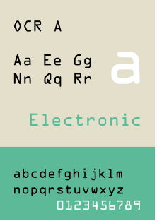
Paper mail is about user experience too, not just ads, but letters too, especially the ones sending out IDs or credentials.
There were three characters that could either be an oh or a zero, so it took me half the permutations to get it right.
A font like Consolas is fine for that (and ships with Windows). Even better: use OCR A.
Based on [Wayback/Archive] Jeroen Wiert Pluimers on Twitter: “Tip voor @xs4all: In de rest van de xs4all->KPN migratie, stuur “Onderwerp Uw wachtwoord voor Telefonie” brieven gaarne in een lettertype waar de 000 en OOO heel duidelijk van elkaar kunnen worden onderscheiden. Hier 4 pogingen (de helft van de permutaties) nodig gehad. “
–jeroen

Posted in Development, Software Development, User Experience (ux) | Leave a Comment »
Posted by jpluimers on 2022/06/20
[Wayback/Archive] Beëindig je oude spaarproduct – ING – Sparen: tot 1 juli kan dit nog zonder EUR 75 aan kosten.
De flow bestaat uit een stap of 30 (als je kiest voor online identificatie via IDIN) en eindigt heel onverwachts niet op ing.nl, maar op digitaal.id:
Posted in Banking, Development, LifeHacker, Power User, User Experience (ux) | Leave a Comment »
Posted by jpluimers on 2022/02/23
Yesterday I wrote about I consider stealing the user’s time because of a bad UX design among the Dark Patterns.
It was about a site blocking the paste of an e-mail field.
I forgot about an almost Dark Pattern on the same site that might be not obvious for English and French readers, but (though there is little documentation on this) there are a lot of countries having the house number put after the street name.
When filling out forms, it makes a lot of sense to put the house number and street name fields in the order of use for the majority of people living that country.
Not doing so rates a form almost as Dark Pattern, for instance the Dutch “MijnOLVG” site, as this is their account sign-up form:

Posted in Dark Pattern, Development, Power User, Software Development, User Experience (ux), Web Development | Leave a Comment »
Posted by jpluimers on 2022/02/22
I an with [Wayback] Craig Buckler to consider Dark Patterns being wider than the strict sense.
For me anything that costs a user extra time or makes accessibility harder is a Dark Pattern.
So I agree with the issues he explains at [Wayback] The Web’s Most Annoying Dark Patterns – SitePoint
Does the web delight or displease you? Craig lists his least favourite UI and marketing dark patterns. Have you developed on the dark side?

Paste is enabled, but does not function
Having had RSI, I’m dependent on keeping my hands and arms in good shape. This means minimising the use of pointing devices and also trying to minimise typing.
In addition, I have heavily segmented my use of email addresses (among others for cutting down SPAM). Basically any point of contact gets a new email address.
This means I realy on tooling like password managers and email address generators. It means copying and pasting information.
So I bumped into a web-site that disallowed pasting the (unique and long!) email address into the email verification field.
[Archive.is] Jeroen Wiert Pluimers on Twitter: “The @olvg #mijnOLVG site is now on my Dark Patterns list as they make #accessibility harder by blocking pasting into the email address verification field. Blocking the paste-blocker. CC some people advocating mijnolvg.nl @MauricevdBosch @ronklitsie63 @kyntha”
Despite the popup menu, paste didn’t work. Chrome autofill did, but didn’t have the information for this particular (new and unique) email address yet, so could not be used yet.
It is relatively easy to disable a paste block. In this case, I was using chrome, but this can be done with any browser. Some browsers even have optional extensions that can do this for you.
In the case of Chrome, when right clicking, there is an “Inspect” option
Inspect is enabled and actually works.
It inspects the current element, which on this site looks like this:
The element does not contain event handlers. But the code hooks them behind our backs.
On the “Event Listeners” tab on the right, you can see there are two JavaScript methods hooked to the paste handler:
The paste handlers. The first is OK, the second blocks paste.
The first one is OK, though I did not really look into what the proxy does.
Second paste event handler: remove this one.
First paste event handler: keep this one.
The second is not OK, as it effectively prevents the event from being handled any further at all by calling preventDefault
Second paste event handler: remove this one.
- [Wayback] Event.preventDefault() – Web APIs | MDN
The Event interface’s preventDefault() method tells the user agent that if the event does not get explicitly handled, its default action should not be taken as it normally would be.
By clicking on the second Remove button above, the paste blocker is gone and you can paste again.
–jeroen

Posted in Chrome, Chrome, Dark Pattern, Development, Google, JavaScript/ECMAScript, Power User, Scripting, Software Development, User Experience (ux), Web Browsers | Leave a Comment »
Posted by jpluimers on 2022/02/09
Nowadays, some 35 years after the first Unicode ideas got drafted and 30+ years after the Unicode Consortium saw the light, UTF-8 is served my more than 95% of the web as shown in yesterday’s post UTF-8 web adoption is huge, closing 100%, but only soured up since around 2006..
I mentioned this:
It means that nowadays there is a very small chance you will see mangled characters (what Japanese call mojibake) when you’re surfing the web.
Below are some issues that happened not too long ago and still happen. I have reported them to all parties involved through web-care, but no response whatsoever, and this is bad: Unicode support beyond basic ASCII for the below systems are still broken even for relatively simple non-ASCII characters based in diacritics decorating a standard ASCII character.
Yes, I know the realm of encoding and code pages is a mess, especially when handling data in multiple layers of an application stack. That’s why I wrote this post in the first place, and have a whole encoding category of blog posts plus a Mojibake subset.

Posted in Communications Development, CP850, Dark Pattern, Development, Encoding, ISO-8859, ISO8859, Mojibake, Software Development, Unicode, User Experience (ux), UTF-16, UTF-8, Windows-1252 | Leave a Comment »
Posted by jpluimers on 2021/12/22
[Wayback] Contact opnemen | Persoonsgebonden budget | SVB had this:
UX: 2FA needed as of October, but which year?
If you are going to introduce a change in a certain period of time, ensure you not just mention only a part of when it occurs: include at least year and month, possibly even day and time.
That way your users know if they still have some time left to setup 2FA, or won’t be able to logon without 2FA at all.

Posted in Development, SocialMedia, Software Development, User Experience (ux), WhatsApp | Leave a Comment »
Posted by jpluimers on 2021/06/29
At the bottom a few examples on on how not do do user experience.
Most of them are related to public traffic ticket vending machines, which seem to have a common pattern of having very low usability.
There is one example I know that has quite a good user experience, because taking usability into account aspart of the design was done at the start of the project.
This is contrary to most machines: they are built by engineers just taking into account their needs and challenges: build from existing parts, allowing for easier serviceability, aiming for ease of manufacturing.
Dutch GVB did it differently: they hired Dutch design agency [WayBack] Fabrique to design and test the user experience before the whole machine went into production.
This resulted in a machine that combines easy usability, good servicing, and straightforward manufacturing process. In addition, an “extended” version that allows for non-electronic payment was designed and manufactured in the same go.
Fabrique is a strategic design agency, specialised in service design, app development, e-commerce and website design. Discover Fabrique!
(Note I am not affiliated, nor endorsed by Fabrique. I just think they did a very good job)
Here are some pictures of the designed and manufactured machines; the vertical stripes light up the place where the next user interaction takes place:

Posted in Development, Software Development, Usability, User Experience (ux) | Leave a Comment »